Athena Design System 2.0
Enterprise design system that became the foundation for Plastiq's IPO-era brand.
Plastiq · 2021 · Lead Product Designer — Visual, UX & Interaction Design
- Design System
- Enterprise
- Cross-functional
- 3+ — Products standardized
- 1 — Cross-org process built
- IPO — Foundation for readiness
Challenge
Siloed teams creating inconsistent patterns, duplicate work, and a confusing product experience. Design had no process. Engineering couldn't pick up components. Product was shipping features faster than the system could absorb them.
Approach
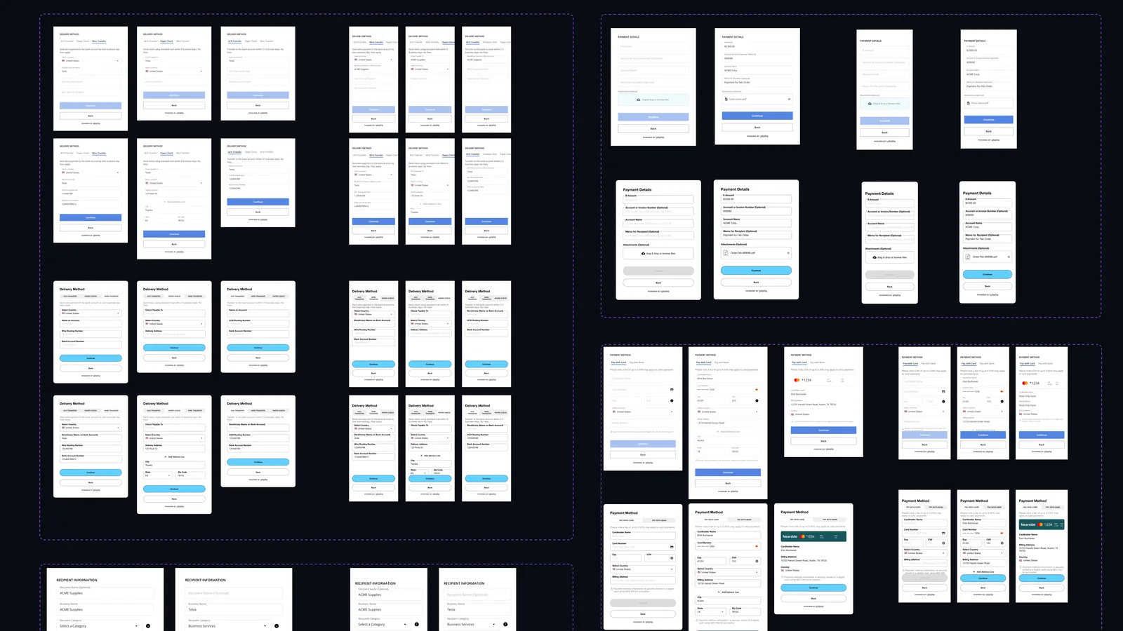
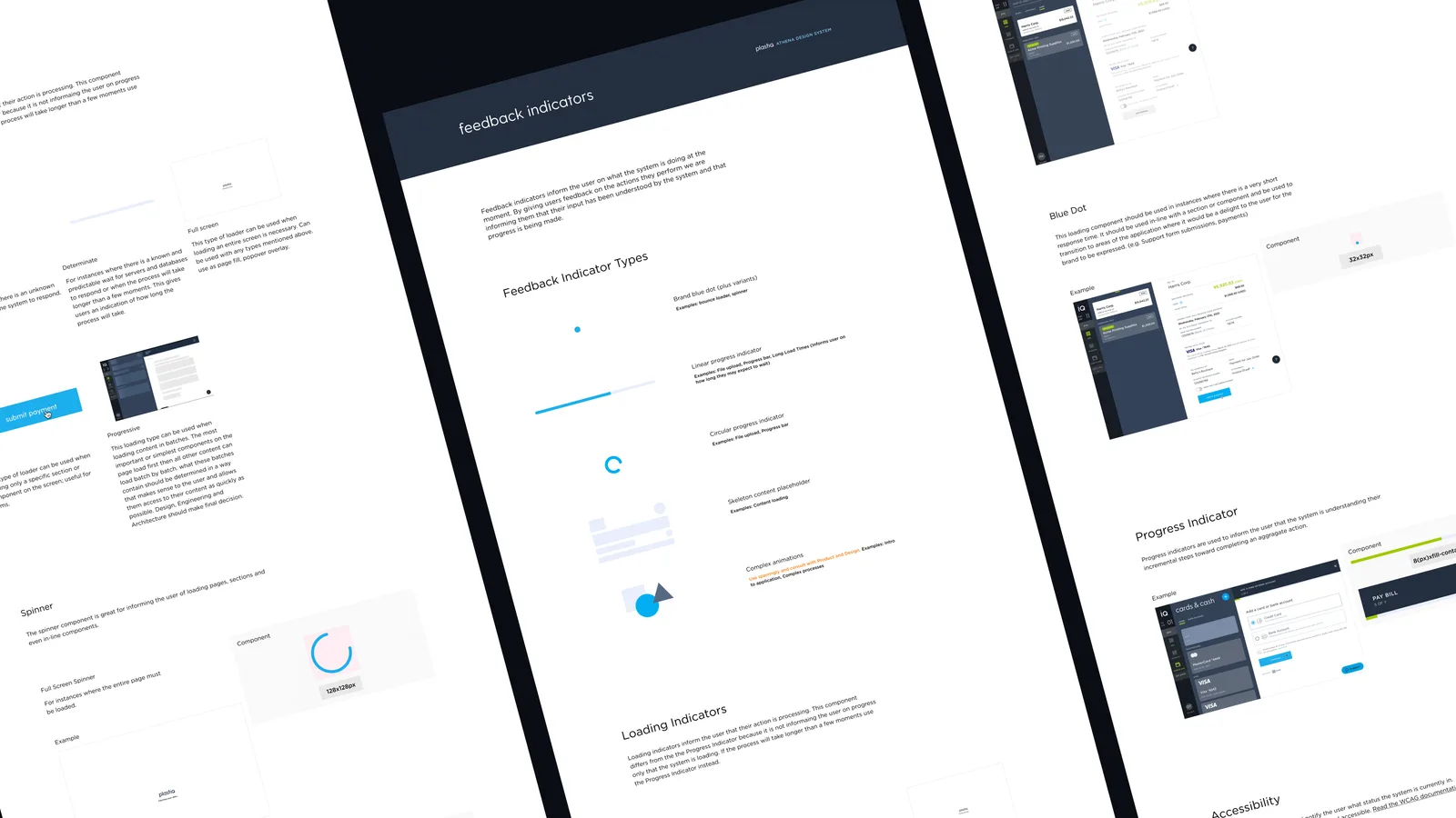
Co-led workshops to establish design system principles and KPIs. Audited all products holistically. Built documentation around layout grid, dashboard components, payment widget, and feedback indicators. Collaborated with Engineering to build a Storybook equivalent. Created foundational elements: Type, Color, Brand, Spacing — all scoped to scale across multiple products and marketing channels.
Outcome
Engineering pickup time for global components dropped significantly. Design and product teams aligned on goals. Consistent brand language across all DS-adopted surfaces. The DS became Plastiq's foundation for its IPO-era brand evolution.
Project Summary
I am leading the design system (DS) effort (along with co-lead Danny Lopez) to create consistency, increase development efficiency, and decrease time to implementation throughout Plastiq’s suite of products. I work on transforming Athena, previously only a component library, to an enterprise level design system that can solve for a host of products and marketing channels. I did this by guiding our team through workshops to gain a purpose and principles for our DS and also identify issues affecting our products. Additionally, I worked on revamping our components by adding usage documentation and encouraging the Engineering team into creating a Storybook equivalent to our effort.
The Challenge
After observing the poor user experience from a portion of our products features and hearing the same feedback from stakeholders and users I decided to begin taking steps towards fixing it. The reasons for that were evident from the moment I joined the organization. I spent a considerable amount focusing on the issues Plastiq faced from a Product, Design and Engineering perspective as well as the concerns of the many different users of our products.
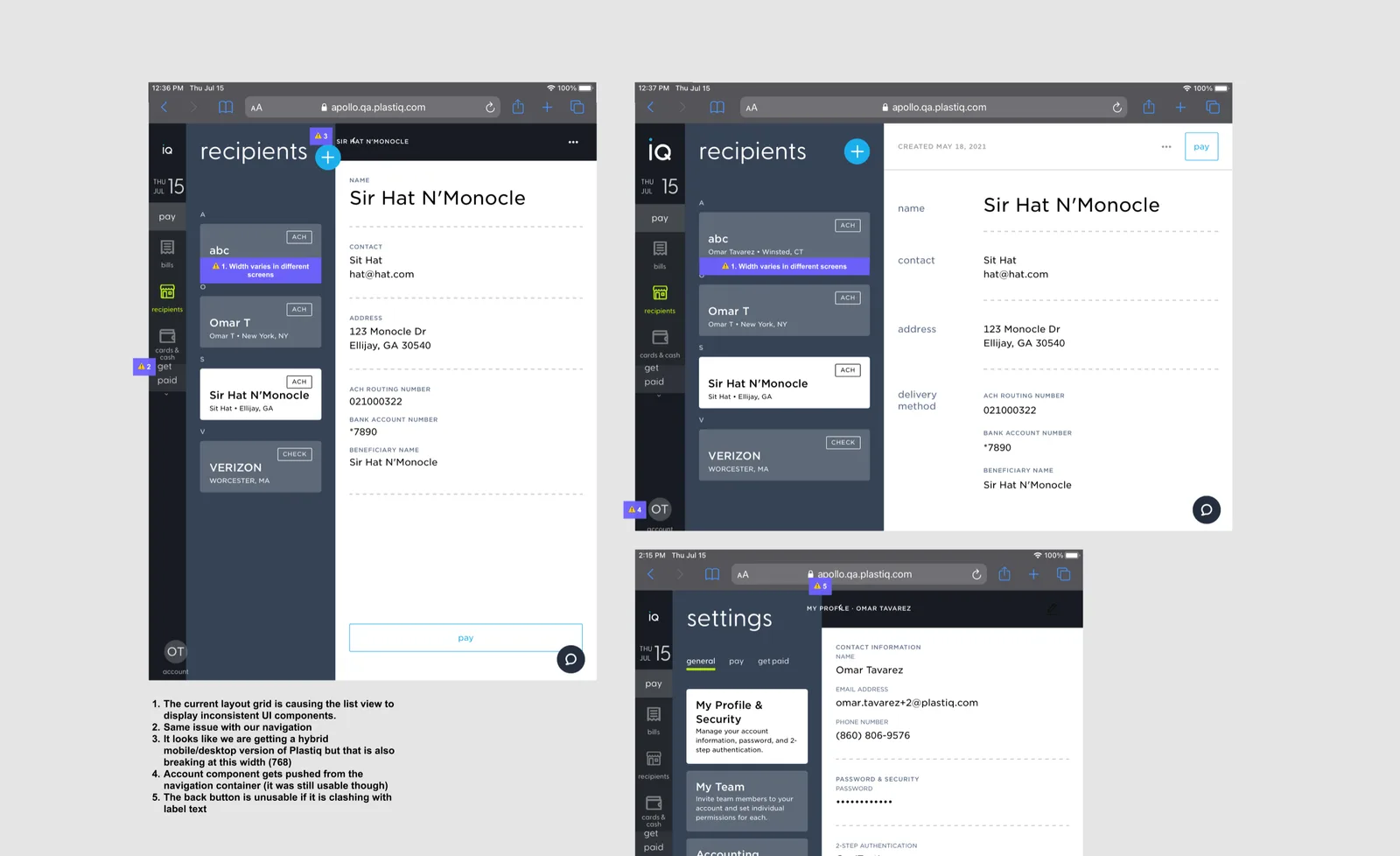
What I found was that there was a lack of consistency in the way we built products. Simply put, there was a lack of process. Development had too many dependencies and could not pick up code already built in many cases; designers were creating too many variants to already existing patterns and product was building too many features too quickly which lead to too much duplicate work that was inconsistent. All these things contributed to a product that confused the user and failed to deliver on the KPI’s set forth by the organization.
The Solution
Getting the team aligned
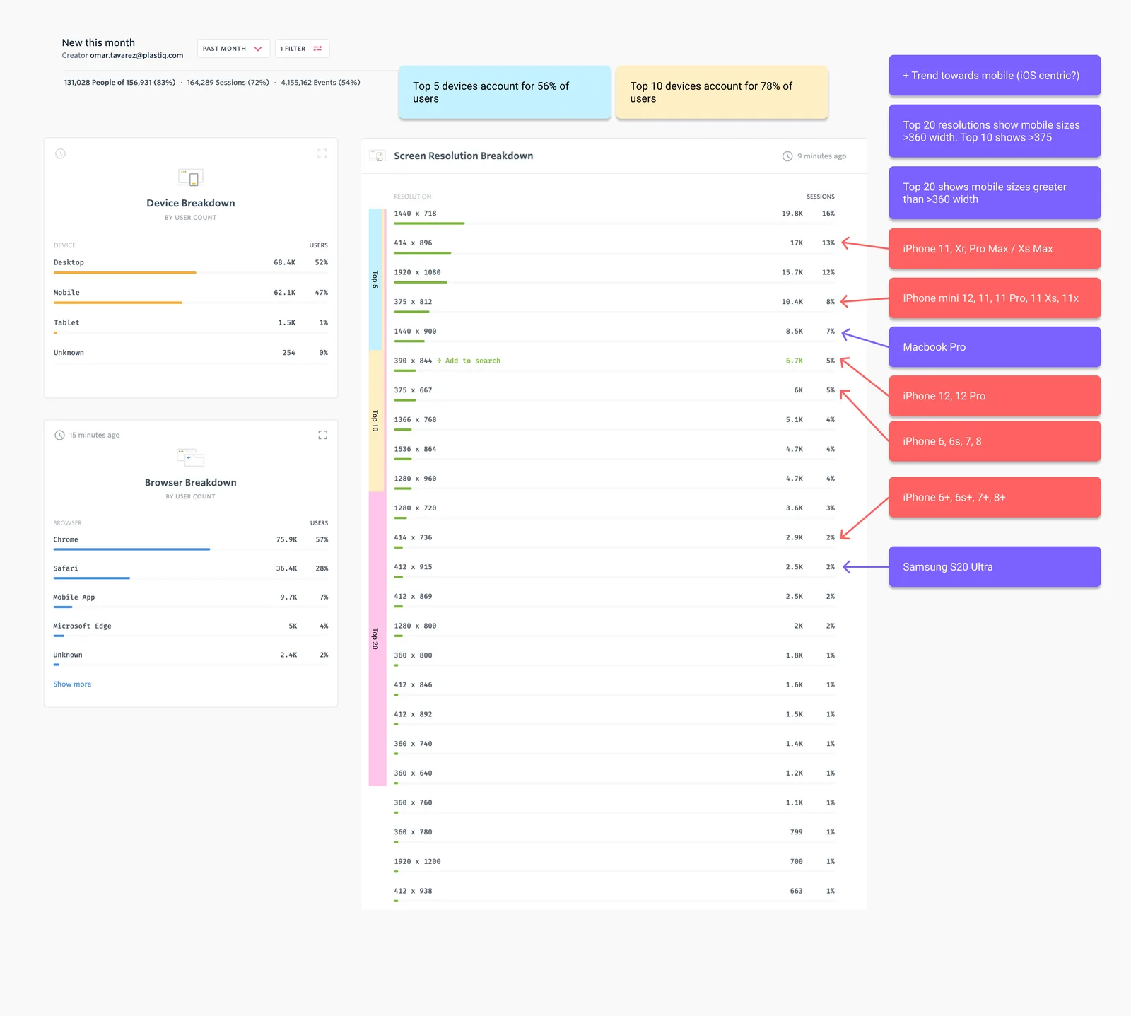
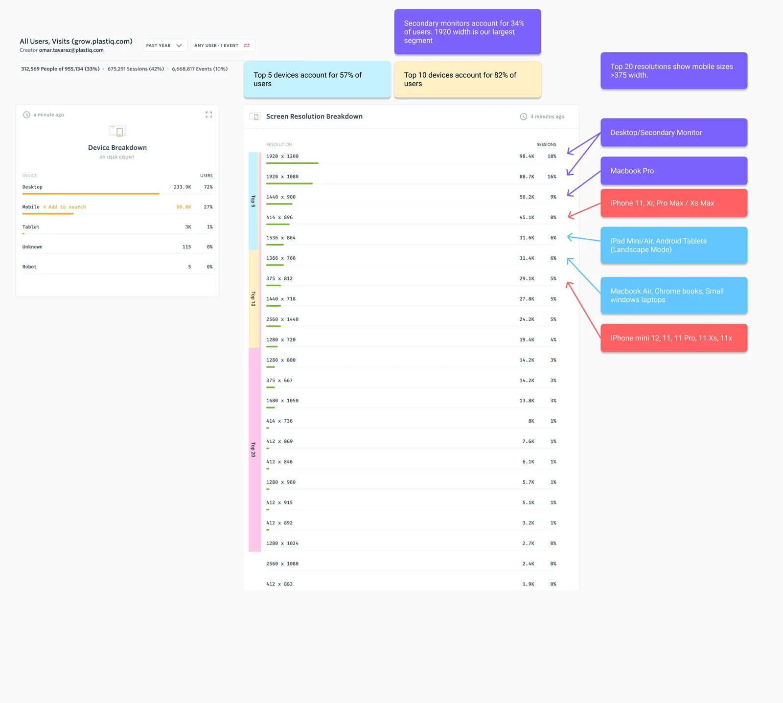
To begin the DS team and I began taking a look at all of our products and features holistically. We started by auditing the core Pay product and branched out from there. I began to notice inconsistent nomenclature, messaging and UI patterns amongst other things that have an impact on user experience. I noted some of the issues and how they could be impacting the organization and product streams. This gave us a broad understanding the steps we needed to take to remedy the issues.
Before I produced any assets I wanted to make sure that the organization as whole and the Product, Design and Engineering teams were aligned. To do that, the co-lead and I developed a series of workshops that assisted us in establishing our KPI’s which included fewer development hours, a more streamlined process bringing features to market and several others.
I then moved on to gathering case studies and research regarding the impact of design systems. I needed to now “evangelize” the DS throughout the organization. I knew that this would help align teams as well as bring awareness to some of the issues we have all been facing. I then, along with my co-lead, began synthesizing this information to present to the company and key stake holders.
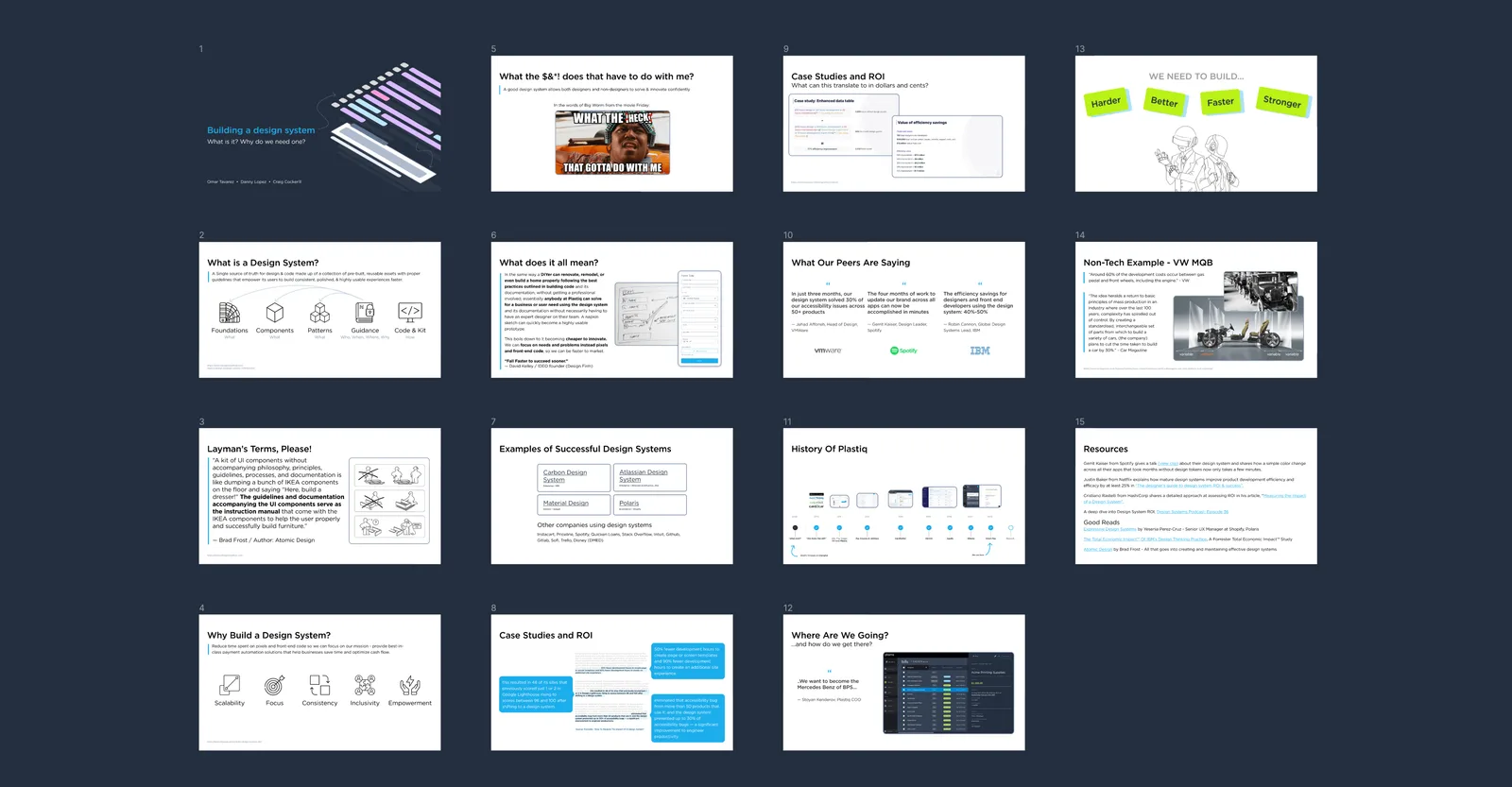
This resulted in several stakeholders showing full support of our efforts as well as a small team of dedicated developers who volunteered to work with us to build Plastiq’s first fully-fledged Design System.
Establishing a process
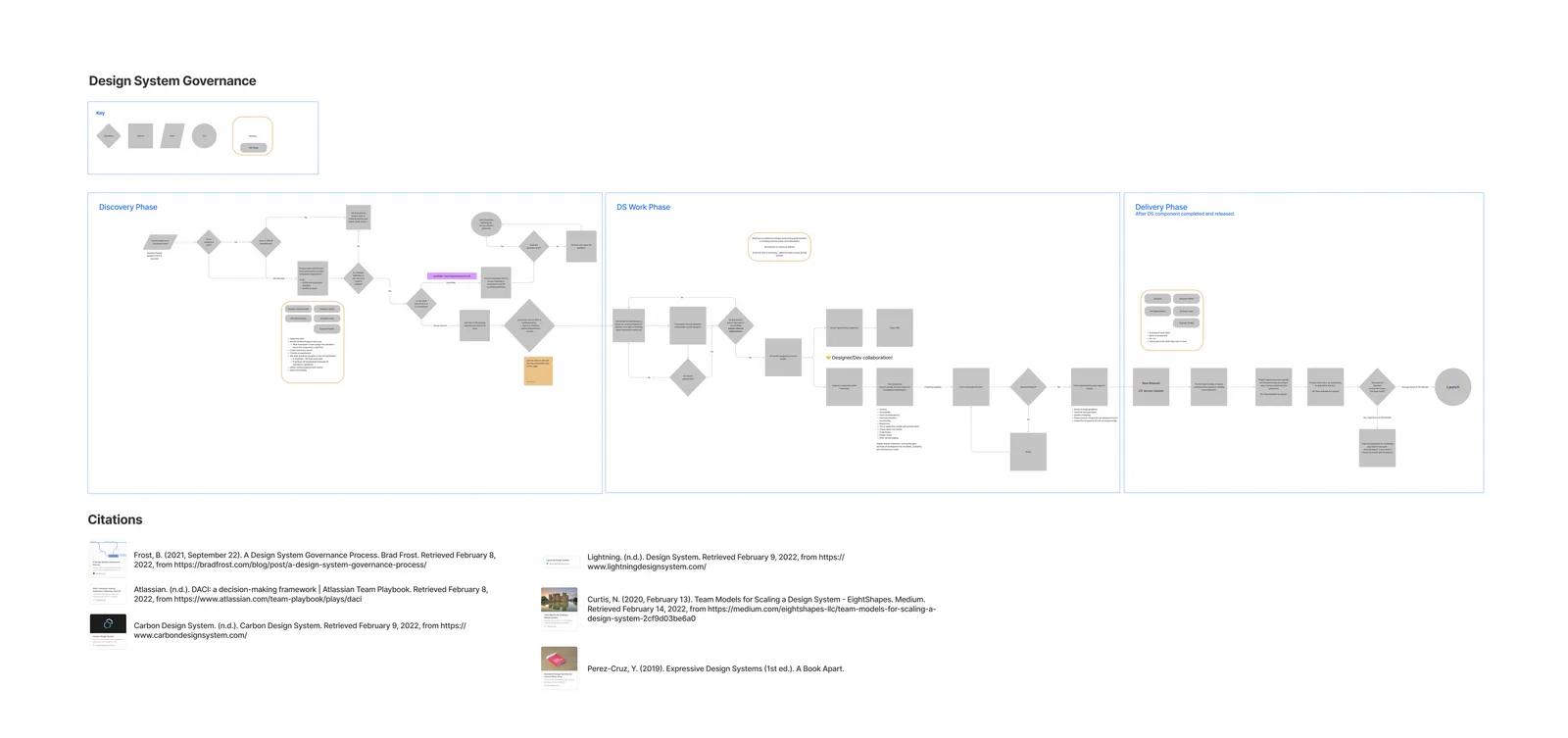
For the DS to work as intended teams throughout the organization needed to be able to consume and contribute to the DS. After spending a considerable amount of time brainstorming and researching the best methods we landed on a process that referenced Brad Frost’s Design System Governance Process but incorporated Plastiq’s way of work. Once this was solidified and the administrators of the DS were in agreement, we documented the process for all to refer to.
Systemizing design and code
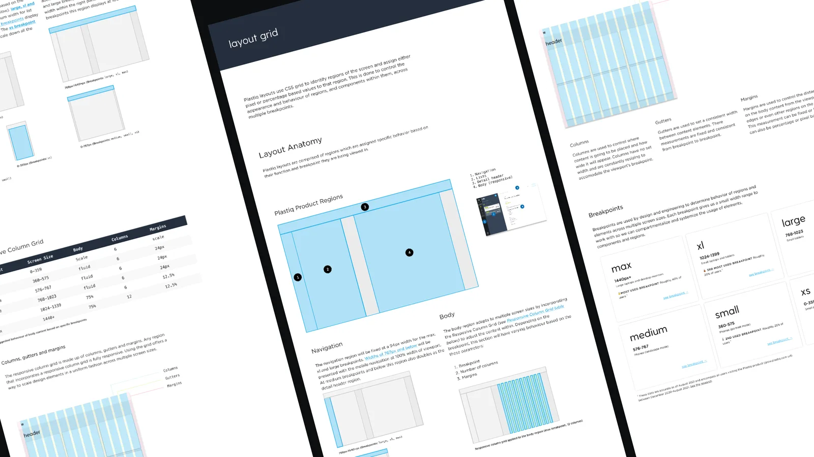
To ensure that consistent design patterns, components and reusable code were being created my co-lead and I began to work on the documentation of usage for the existing component library. We divided the work based on the product needs at the moment. I began creating documentation around layout grid, dashboard components, payment widget and feedback indicators. Those items could be used immediately to remedy some of the issues we discovered during our audit. The payment widget was by far our most used as it was the core of our product. Layout grid alone could fix a major issue in the way we accommodate UI elements at multiple breakpoints.
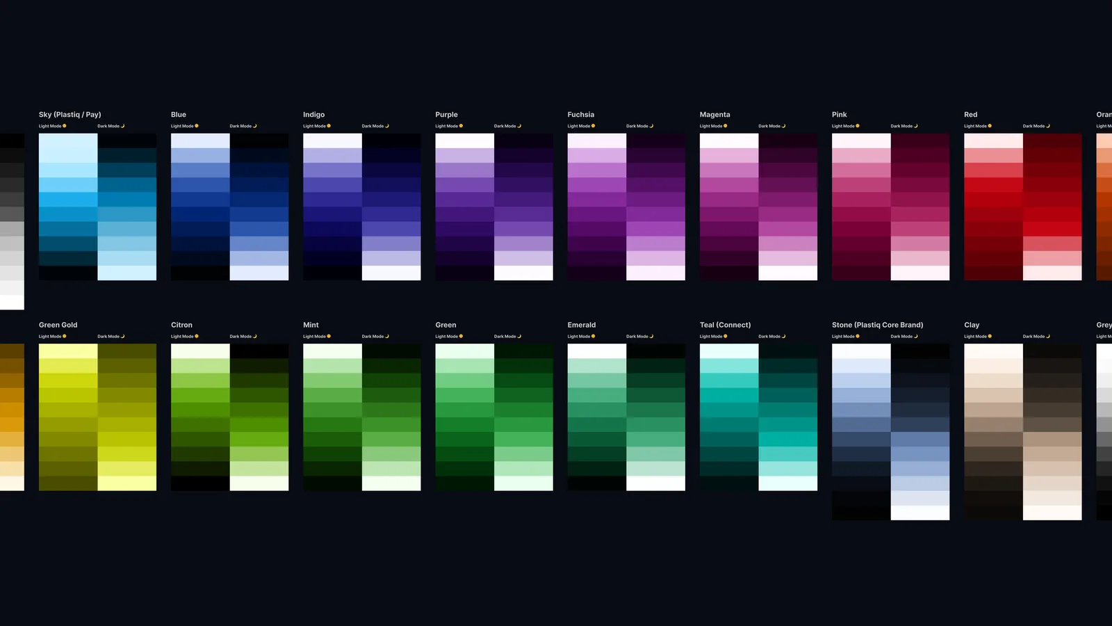
Next, the co-lead and I worked on revamping our brand and creating new foundational elements for Athena DS. We did this by referring back to our product needs that were discovered during our audits. We knew that we needed to create a system that was scalable across multiple products and marketing channels as well. These foundational elements included Type, Color, Brand and Spacing. Once completed this same foundation would go on to be used across our marketing site too. (See Case Study ↗)
Results
Even though certain components and foundational elements are still in production; we have seen the results of creating the process, documentation and components. The it is more efficient than ever for the Engineering teams to pick up global components, layouts and templates to create new products, pages, and features. The design and product teams have better alignment on the goals of the company and future of the product. This has lead to more consistent work from everyone that builds anything for the product. In the areas of the product and marketing site that are using the DS you can see a noticeable improvement in consistency of user experience and brand language.
All the work thus far and future work culminate into a long-term effort that will catapult this company’s image from a mature start-up to an industry leader in the public space. At the moment, we are working as an org to expand our efforts towards the DS. We continue to improve current DS elements and elaborate on future additions to the DS which will help previous stated goals.